Orange & Lemon - Fruit Colour Inspo
FRUIT INSPO: ORANGE
Citrusly! Orange you glad to see this? A vibrant pop of color can create a happy home and a cheerful mood! This bold and underrated colour is a perfect but unexpected twist to your Scandinavian or Modern design.
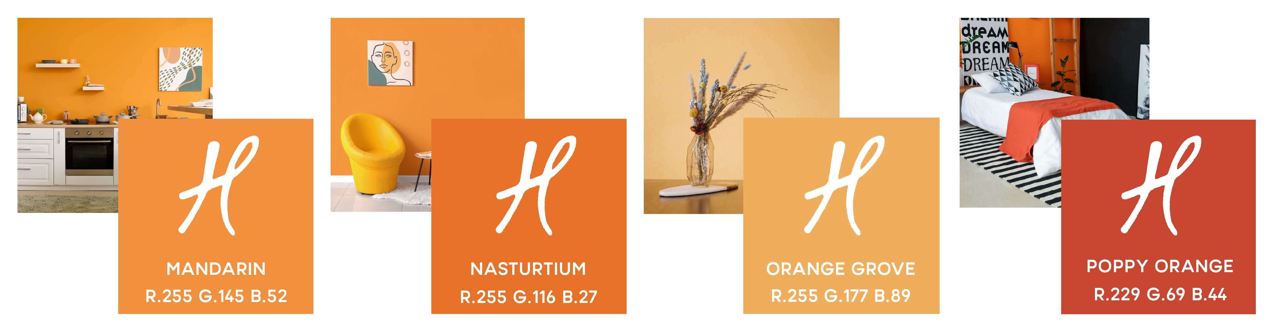
These oranges are epic and guaranteed to light up any room!
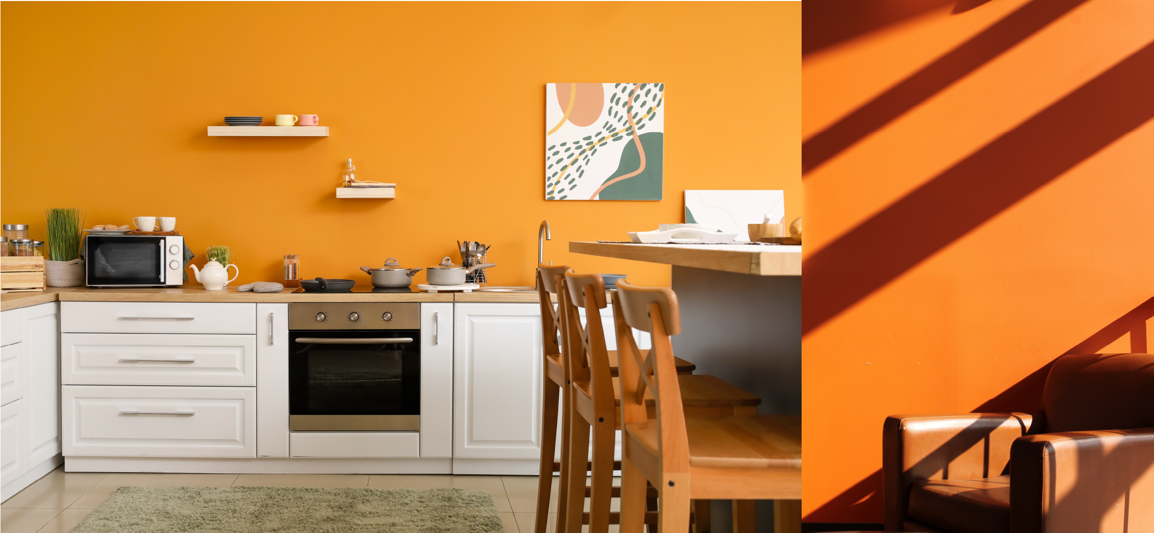
Orange may not have been your first through for a room or kitchen – but if you’re looking for something a bit different and super vibrant – then you may have found an answer. Just remember to pair with some beautiful browns like Haymes Paints: Tundra Earth or check out some neutrals from our other blogs!
Artwork is a clever piece of design and decor in any space as it can also be used as part of your colour theme to break up a palette or help to combine your colour scheme into a pleasing aesthetic. The artwork in the images above and below (above right image – below left image, they’ve used a piece of artwork that really helps to neutralize the bold colours and its unsaturated green (which is very similar to Forest Shade by Haymes Paints) helps to alleviate the overwhelming warmth to bring it back to a nice earthy middle-ground which up a space for a nice earthy rug without being too much.
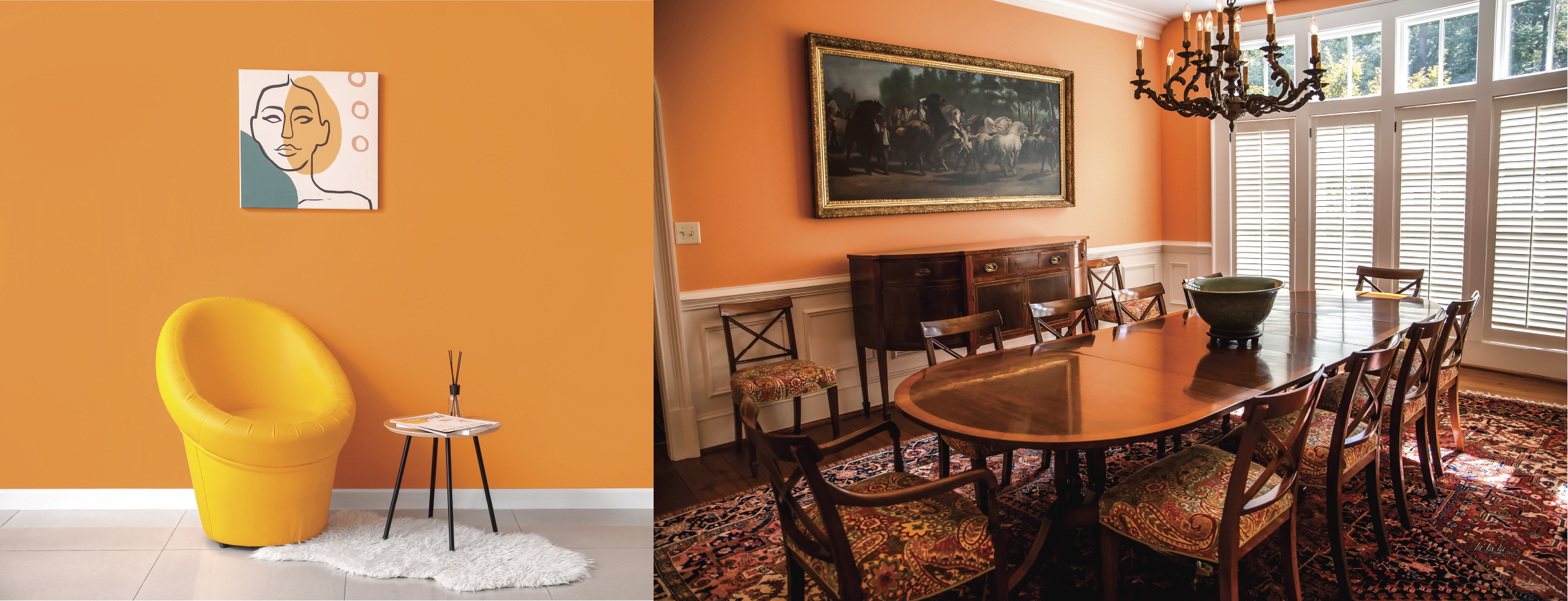
Remember that if you’re using artwork as part of your interior aesthetic, give it room to breathe - notice that this is the only artwork on the wall in these images.
“Colours, like features, follow the changes of emotions” - Pablo Picasso
To see the full range of orange paints available, go to:
https://www.haymespaint.com.au/index.php/explore-colours/colour-range/view/11
FRUIT INSPO: LEMON
Not only is the colour of lemon, sublime - yellow increases mental activity, heightens one’s awareness, increases energy levels and metabolic rates - so if you’d love to add some Lemon vibes to your space - it’s ‘simply the zest!’
Now this is how your feature Lemon!
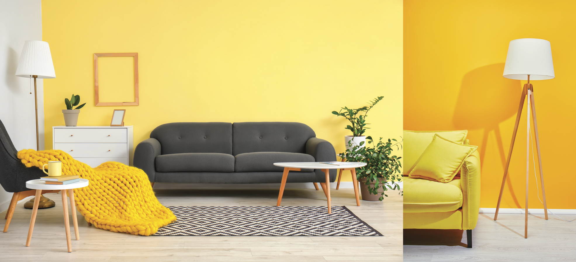
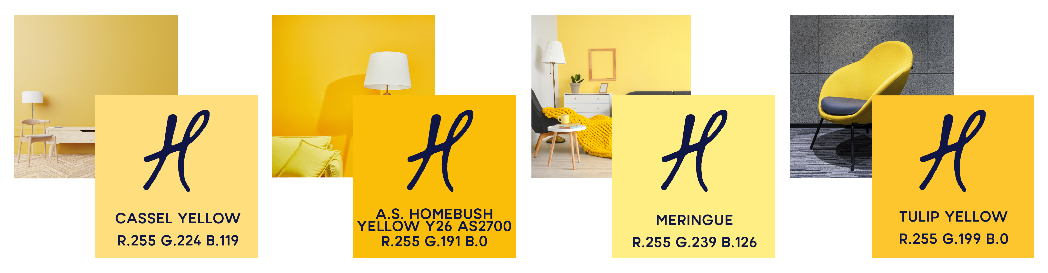
Let’s really look at these spaces and start with the main features - the yellow wall - which is a colour close to the Haymes Paint: Meringue (in the Left image) and Tulip Yellow or Australian Standards Homebush Yellow Y26 AS2700 (in the Right image). If you’re looking for a happy but not over-saturated colour to brighten up your space then the left image is more for you - this is an excellent choice and gives you so many palette options for accents, furniture, and decor. However, if you love that bold colour in the right image – go for it!
The non-feature-wall in the left image (above) is a shade of white, which is like Essential by Haymes Paint - it’s on the warmer side of the spectrum but ensures a neutralizing effect so that decor doesn’t look mismatched to the colour space.
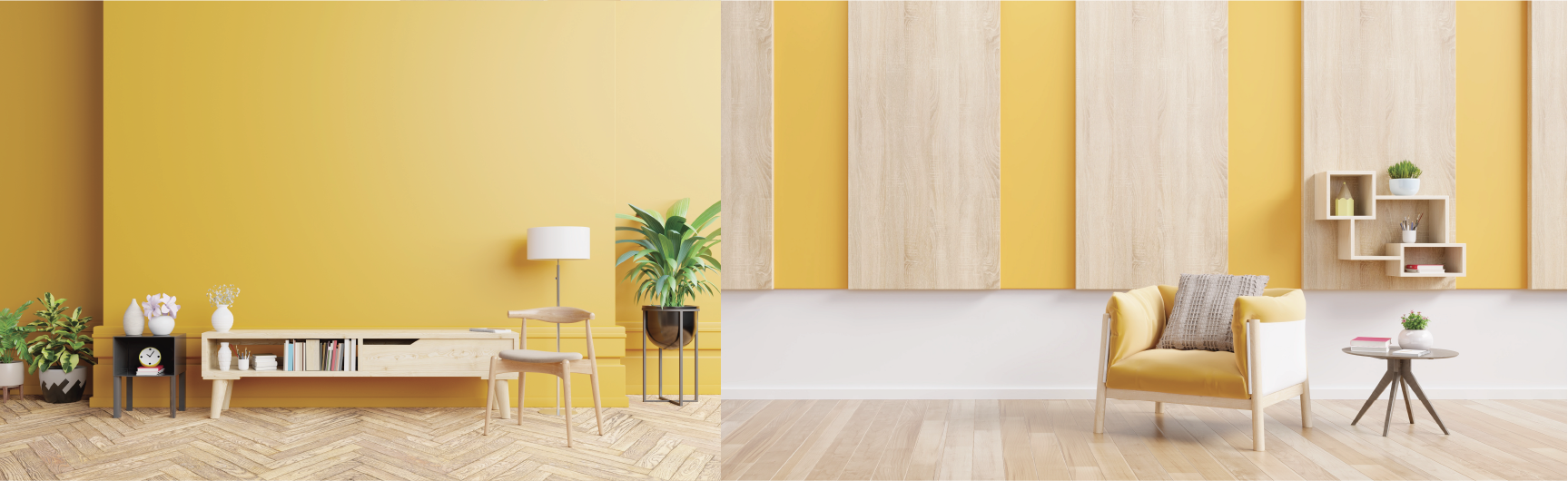
Remember that it’s not always the wall colour which provides context to a space; the flooring in these pieces is also important as it builds to the wall colour and makes texture a great component. The use of houseplants here is very welcomed as it’s complimenting the freshness of the yellow and makes anything neutral a great contemporary fit.
It’s important to know that any shade is recreate able for any piece you can imagine.
#squeezetheday.
For even more information and ideas, feel free to check out these other great blogs!